Element7 visual identity
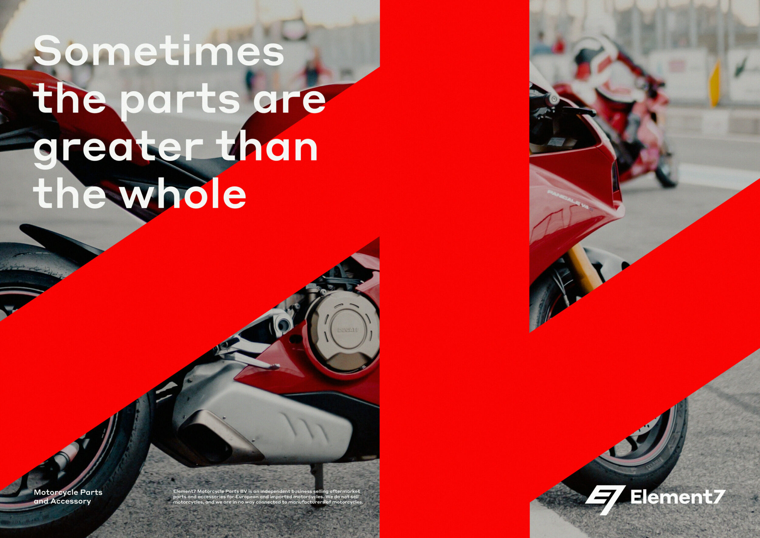
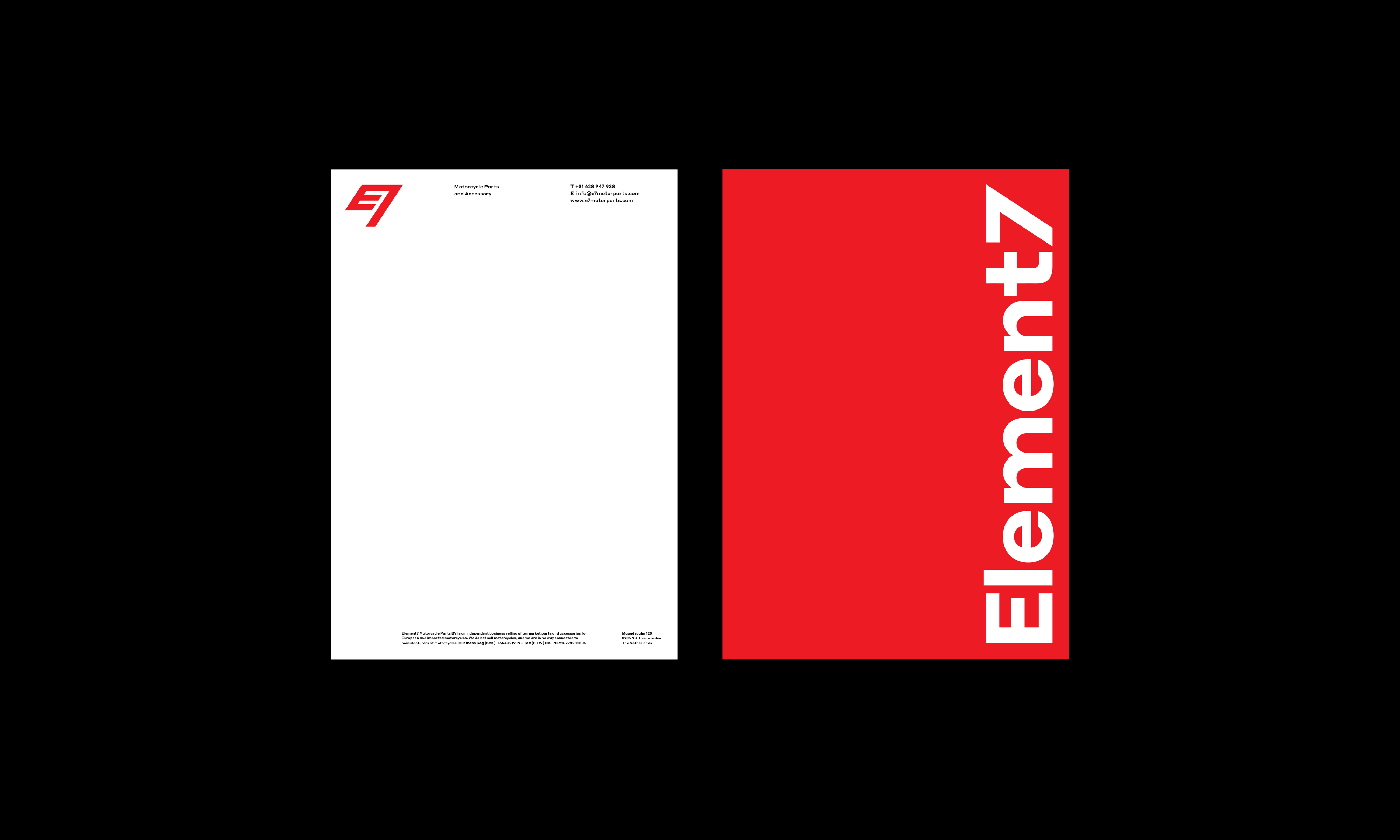
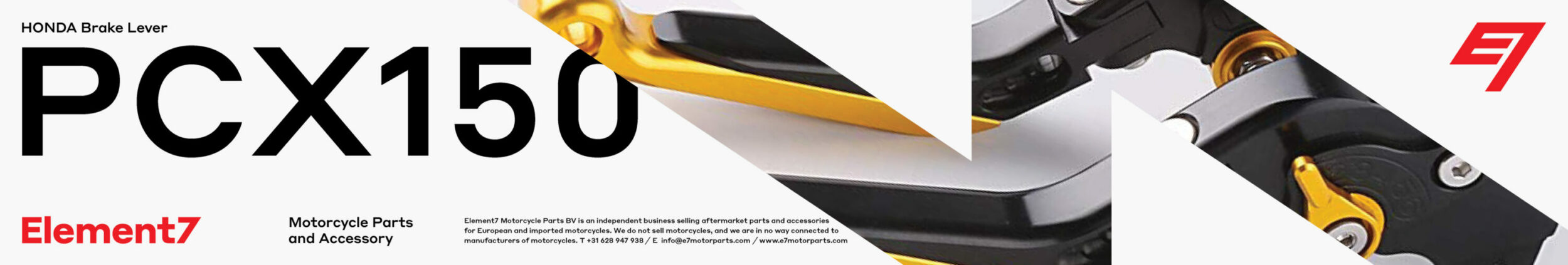
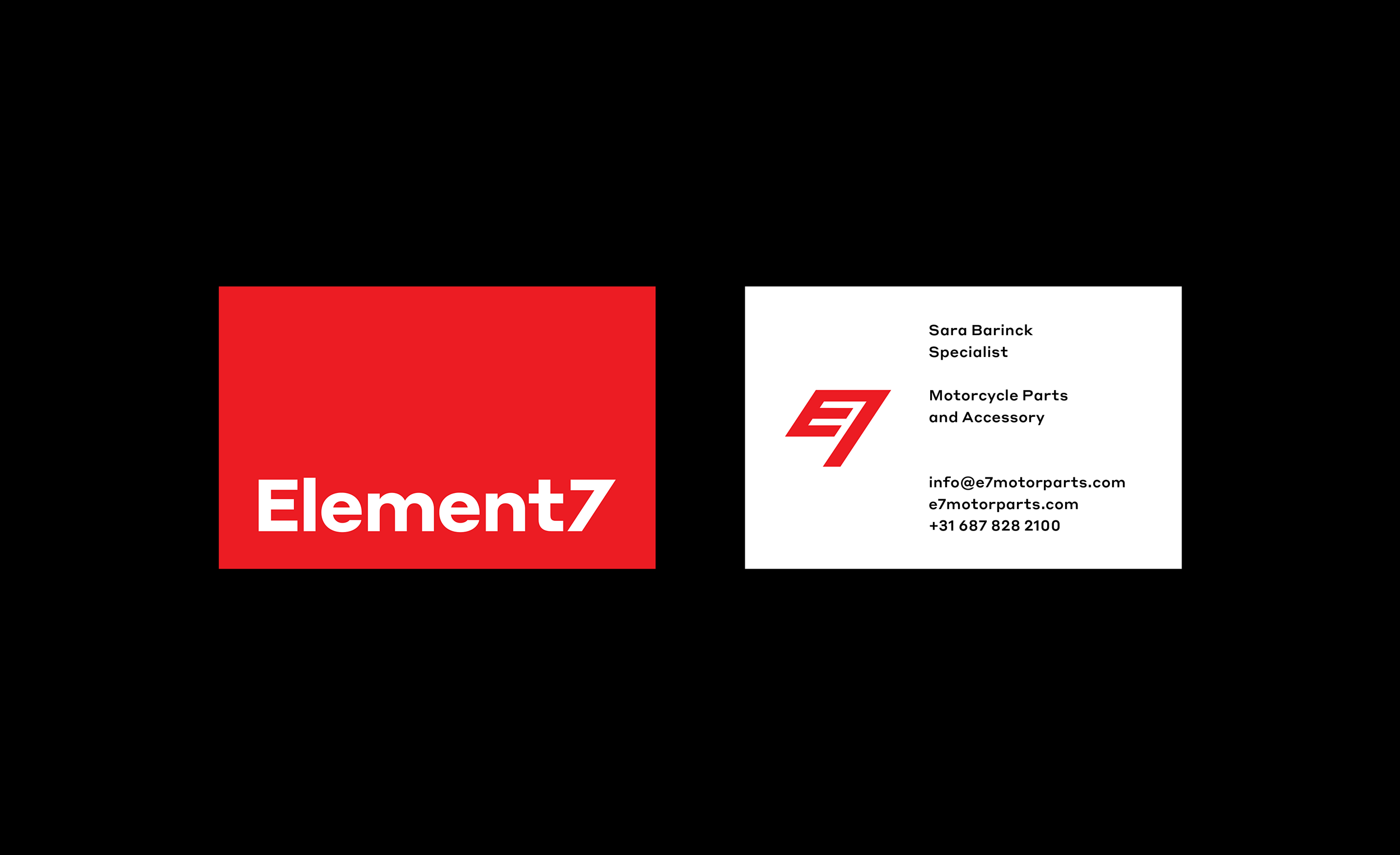
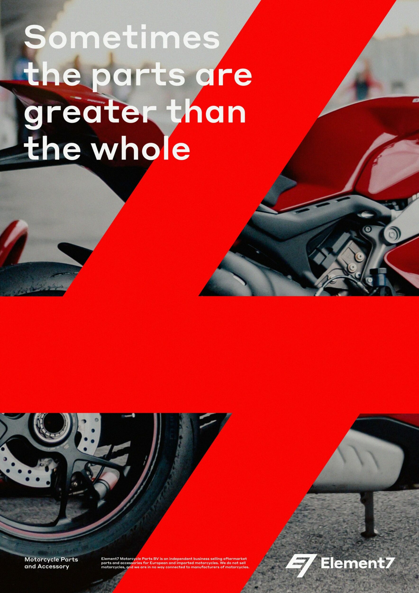
All these parts will be replaced. Element7 is a motorcycle part and accessory business. They needed a name and logo to set them apart from competing motor repair- and parts shops, and in addition to building a business that also provides other services and develops its own products. After we established the direction and the name, we designed a symbol formed by the letters “E7”; a flag as a racing metaphor to signal riders (in that case) of a pit stop. The dynamic shapes are taken from the symbol, to create a graphic component that can be applied to visuals—to dismantle and reassemble—and it also serves as the brand’s graphic language.
Service: Strategy, Naming, Content, and Motion
Design Principal: Maxwell A. Davis
Design/Agency: StudioTBT
Typeface: Commercial Type
Client: Element7 Motorcycle Parts BV, Year: 2020